SST Web Component Design System
Simpson Strong-Tie's first cross-app component set — built on Lit web components so one implementation could drop into jQuery, React, and .NET Blazor from a single source of design tokens.
The brief
By 2023, Simpson Strong-Tie’s applications were spread across a wide range of frameworks — jQuery, React, and a large base of .NET Blazor — and every team rebuilt the same buttons, inputs, and dialogs on its own stack. The brief was to give the whole organization one component set that could drop into any of them.
Why web components
Web components were the one technology every framework could consume natively, so I built the library on Lit — standards-based custom elements that render the same whether they sit inside a jQuery page, a React app, or a .NET Blazor view. One implementation of each component, styled from a shared set of design tokens, instead of a separate build per framework.
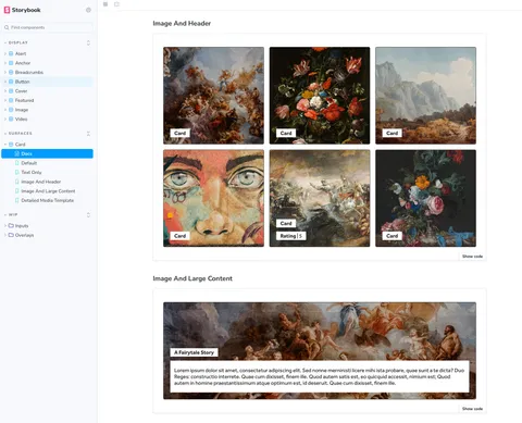
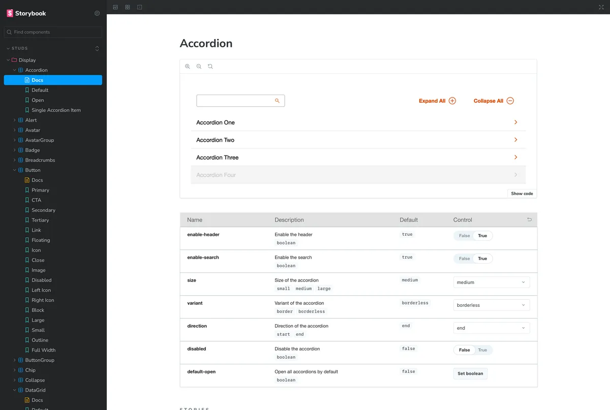
Everything was documented in Storybook and distributed the way each ecosystem already expected it — npm for the JavaScript apps, NuGet for the .NET side — so a team could adopt a component without adopting a new build system.
What it proved, and its limit
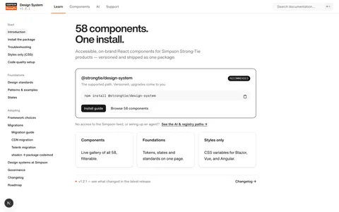
This was the first generation to put a single, shared component set in front of teams across the company, and it proved the model: design tokens and framework-agnostic components really could give very different apps one consistent UI. Its limit was the browser baseline — the custom-element approach targeted modern browsers, and the organization’s large base of older, established applications couldn’t all come along. That constraint is what shaped the generation that followed.
What it led to
The lessons carried straight forward: meet teams on the stack they already use, distribute through the tooling they already have, and treat design tokens as the source of truth. All three became load-bearing in the current Simpson Strong-Tie design system, which reaches the legacy apps this generation couldn’t.