The tokens this site is built from
Every size, radius, shadow, and rhythm on this portfolio resolves from one scale. This page is that scale — it defines nothing of its own, and every specimen below is drawn by consuming the same :root tokens the rest of the site uses. Toggle the theme in the header to watch one token redefinition re-skin the whole system.
74type-scale references
67tracking references
40spacing references
4elevation tokens
Semantic palette
Ink, surface and structure neutrals sit cool and quiet, so the terracotta brand is the only colour doing any work. The luminance ramp is derived from --brand withcolor-mix, so it re-tints itself per theme.
--brandD0542A
--brand-deepAA4522
--ink0E0F12
--ink-22A2D33
--ink-35A5F6A
--ink-4666B78
--bgF7F8F9
--bg-2FFFFFF
--bg-3EEF0F2
--lineE3E5E8
--line-strongCFD3D8
Brand luminance ramp
The contribution heatmap and its legend both draw from--brand-l1…l4, so the key always matches the graph it describes.
LessMore
Type scale
Thirteen steps, --fs-25 to--fs-1000. The bottom six rungs are fluid and floor at 13px, so a phone never inherits a desktop label size;--fs-25 is the one exception at 11→12px, reserved for the contribution heatmap's axes. --fs-75 and--fs-200 carry small labels, set in the label voice below.
--fs-2511 → 12pxDesign systems, documented.
--fs-5013 → 14pxDesign systems, documented.
--fs-7513 → 14pxDesign systems, documented.
--fs-10014 → 15pxDesign systems, documented.
--fs-20014 → 16pxDesign systems, documented.
--fs-30015 → 17pxDesign systems, documented.
--fs-40015pxDesign systems, documented.
--fs-50016pxDesign systems, documented.
--fs-60017pxDesign systems, documented.
--fs-70018pxDesign systems, documented.
--fs-80019pxDesign systems, documented.
--fs-90022pxDesign systems, documented.
--fs-100024pxDesign systems, documented.
Letter-spacing
A wide ramp (--ls-1…5), now kept for data labels in tables, and a tight ramp for display headings (--ls-tight-*). Everyday labels read--label-tracking, which isnormal.
--ls-10.04emSelected work, 2024
--ls-20.06emSelected work, 2024
--ls-30.08emSelected work, 2024
--ls-40.1emSelected work, 2024
--ls-50.16emSelected work, 2024
--ls-tight-2-0.02emSelected work, 2024
--ls-tight-4-0.03emSelected work, 2024
Corner radius
Seven steps, --r-xs to--r-pill. Every fully-rounded control draws from--r-pill.
--r-xs2px
--r-sm4px
--r-md6px
--r-lg8px
--r-xl10px
--r-2xl12px
--r-pillpill
Shadow presets
Every shadow is built on --ink. Dark mode redefines these four tokens once, so elevation follows the theme without a per-component override.
--shadow-cardfeatured / detail shots
--shadow-popcard hover lift
--shadow-pop-strongproject card hover
--shadow-previewhover preview card
Spacing scale
A 4px base grid, applied to gaps across the site. Twelve steps carry every gap and inset on the page; a handful of off-scale values (6, 10, 18, 22px) are tracked as normalization candidates.
--space-14px
--space-28px
--space-312px
--space-416px
--space-520px
--space-624px
--space-728px
--space-832px
--space-940px
--space-1048px
--space-1156px
--space-1264px
Z-index scale
Four named stacking levels, plus --header-offset(84px), which is shared by scroll-padding, the sticky rail, and anchor margins.
--z-sticky50, header
--z-popover60, preview
--z-toast80, toast
--z-skip100, skip link
Composed from the scale
The reusable primitives, each built entirely from the tokens above and rendered here with the same global classes the rest of the site uses.
Brand mark, <BrandMark />
Buttons, .btn--primary / .btn--ghost
Section heading, <HeadingDot />
Work & education
Topic chips, contact form
Design systemsSpeaking
Text filters, blog archive
All 17Research
Lead statement, home
Right now I'ma Senior Design Technologist at Intuit.
Quote, ink card
The goal was to make the design system the easiest path to good UI
Metadata, commas not dots
Mock-browser frame, live sites only, .vchrome
House rules
The decisions behind this revision, written down so new pages start from them instead of from a template.
Headings end in the logo's square
The orange square from the mark replaces the full stop. Nothing in front of the heading.
No section numbers or eyebrows
A heading introduces its section on its own. Numbers only where order matters, like a post series.
Sentence case, body font
Labels, buttons and nav read --font-label, --label-case and --label-tracking. Mono is for data: dates, ranges, tables, code.
No arrows on links or buttons
External links keep the small ↗ icon. Everything else is plain text.
Commas, not middle dots
Metadata reads as words: “UX Engineer, 2023 – 2026”.
Orange marks one thing at a time
The heading square, the active filter, the lead statement. The hero underline is the one highlighted phrase.
Quotes are ink cards
Dark panel, light text, ending in the square. No tinted boxes with a side bar.
A cool, quiet ground
--bg is #F7F8F9 and --bg-3 is #EEF0F2, so nothing competes with the brand.
The system at share size
Build-time 1200 × 630 images use the same color and tracking tokens as the site. Noto Sans Display substitutes for Effra because the Typekit-licensed face cannot be bundled into the rasterizer.
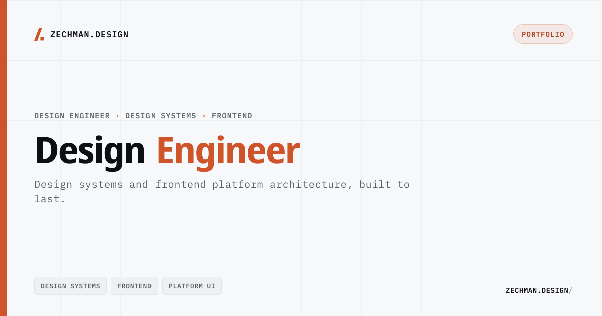
/og/home.png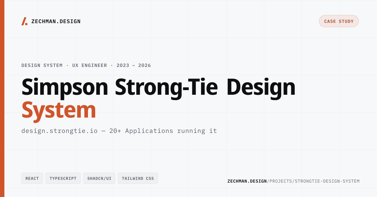

What one scale buys
A single token layer lets a value be defined once and trusted everywhere it is read.
One scale, every surface
Pages, form controls, and the contact form all resolve from the same :root layer — one set of--space-*, --r-* and--fs-* rungs, with no parallel vocabulary to keep in sync.
A chart and its key cannot disagree
The contribution graph colours its cells and its legend from the same --brand-l1…l4 ramp, so the key describes the graph by construction.
One offset, every anchor
--header-offset is the single source for scroll-padding, the sticky rail, and anchor margins — change the header height and all three follow.
Elevation earns its keep
Four shadow recipes, each built on --ink. Dark mode re-bases the tokens once and every elevated surface — cards, detail shots, popovers, the hover preview — follows.